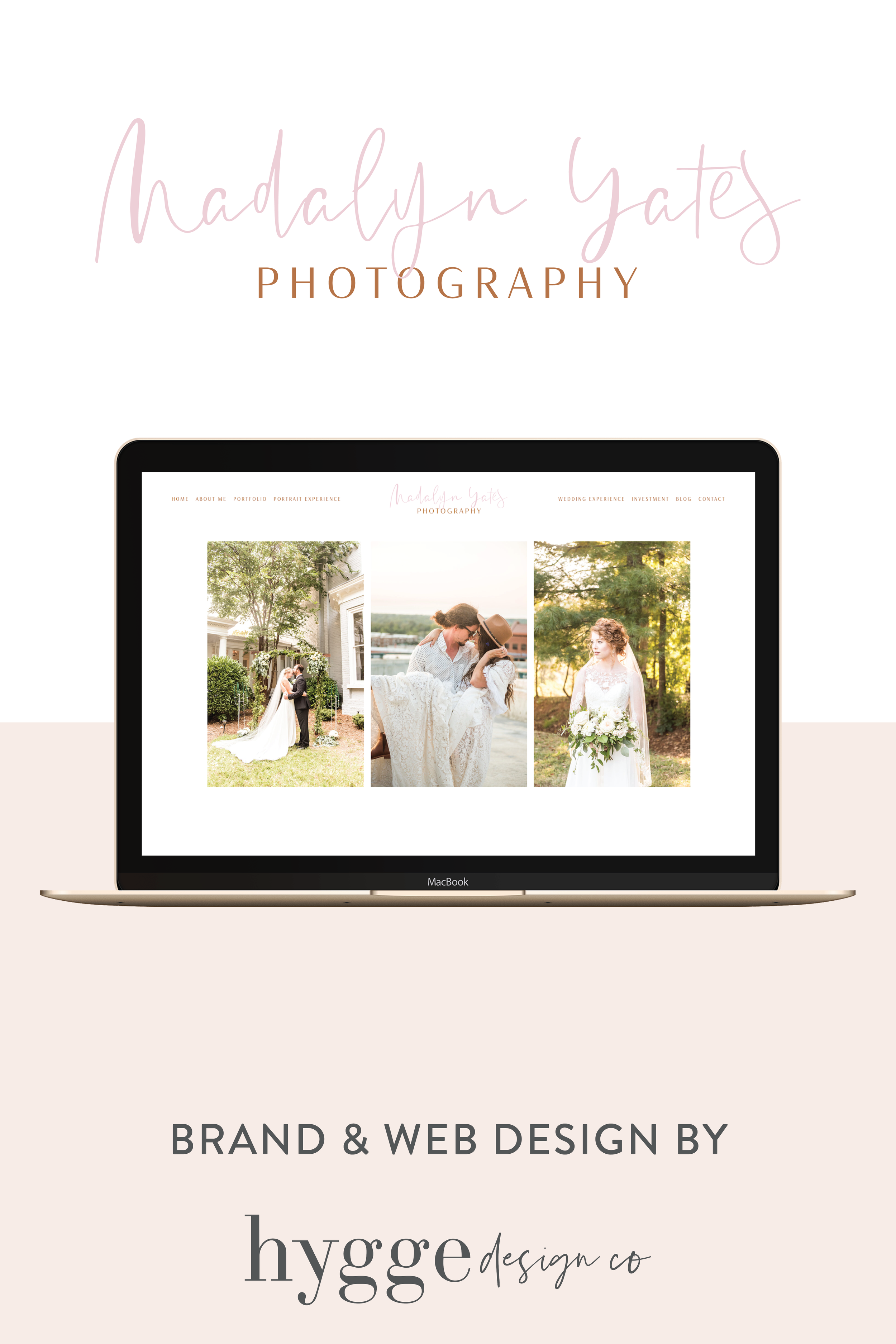
I was so excited to get started on this project, but also a little nervous. It had to be perfect. Not just visually appealing or strategically designed. It had to represent Madalyn and the Madalyn Yates Photography brand and all that it stands for. When you know someone as well as I know Madalyn, that can be both scary and exciting at the same time.
read more →
filed in:
And while email marketing is very much still alive, the increased knowledge about this type of marketing has made it slightly harder to grow and thrive from your list. For instance, it is no longer enough to just say “Sign up for my list” as consumers and potential clients have gotten more protective over their inboxes.
In today’s post, I’ll share how you can easily get started with email marketing workflows using Flodesk!
read more →
filed in:
Have you ever found yourself making decisions based on the shiny new syndrome mixed with a little (or a lot) of FOMO?
Yep. I’ve been there too.
If you’ve been around the Hygge Design Co blog for a hot minute, you’ve heard me rave about MailerLite as my go-to email marketing software. I still stand behind MailerLite, and I think it’s a great, free platform for those just starting out with email marketing. But, I’ve recently been testing out Flodesk, and I must say, I’m very impressed.
In today’s post I’ll share how you can authenticate your domain, and set up your forms so your visitors can sign up for your Flodesk email list!
read more →
filed in:
When you’re first starting out with designing websites on Squarespace, the index pages can be both confusing and intimidating, but they are an essential part of creating unique eye-catching Squarespace websites.
In today’s post, I’ll shed some light on Squarespace index pages to help you understand what they are, when and how you can use them, and also a little Squarespace index page folder menu trick!
read more →
filed in:
The Squarespace summary block is a great way to show off your client praises to convince potential customers of just how wonderful you are to work with.
If you’re trying to make the decision easier for your potential clients, styling your Summary block testimonials with a little CSS can be a great way to further make these stand out and become even more eye catching!
In this blog post I’ll walk you through three different ways you can style your Squarespace summary block testimonials using easy CSS (don’t worry, step by step instructions are included).
read more →
filed in:
No. 3
the experience →
Let's craft a brand and website that truly feels like home so you can attract those dreamy clients with ease.
Work with Ida
No. 2
shop the collection →
Easy to use Showit website templates and add-ons for your creative business!
Showit Template Shop
No. 1
I've gathered up my top tools and resources for running a thriving online business!
Resources
take a look →
Explore More
a match made in heaven:
get the guide →
My 7 day DIY web design process revealed
Sign up below to receive my DIY and get it DONE: The ultimate guide to launching your website in just 7 days that will make the web design process a breeze!
