*this post contains affiliate links!
One of the lessons I quickly learned as I started my brand design business was that most people don’t easily visualize how the various pieces of their brand will come to life, and even where they can be used, especially when it comes to pattern design.
This was part of the reason why I started implementing brand presentations along with mockups in my brand design process early on. It truly helps my clients see all the potential their new brand has!
During these brand presentations, I walk my clients through their new brand identity and show them just a fraction of all the opportunities they have to combine the various brand elements to bring life to their brand. But, I also noticed I was throwing out more ideas as I talked, and one of my clients said that really helped her see her brand in a new light.
So today, I wanted to share some of that with you.
This will be part of a series of blog posts where I share more about the specific elements of a brand, and how they can be utilized both alone and together to truly create that elevated look and feel for your brand.
In today’s post, I’ll focus on brand patterns and textures — the part that many overlook or don’t even think they need.
Ready for it?
Let’s go!
Why pattern design?
Pattern design is one of the best ways to infuse personality and flair to your brand. I like to think of this as the fun, playful part of a brand, where you can really tie all the elements together!
As a designer, patterns are also one of my favorite things to create, as they truly allow me to just be creative, think outside the box, and find solutions to really showcase what makes your brand unique!
Ready to learn more about how to use patterns in your brand? Here are some of my favorite ways!
Stationery and Business Cards
Whether you believe business cards and stationery are a thing of the past or not (I’m a firm believer in thank you cards ;)) there’s something truly magical about seeing your brand in print.
The first time I ordered business cards for my own business from Moo.com (yep! That’s a referral link), I was taken back by how real it suddenly made my business feel.
I’d been blogging, posting on Instagram, and using Pinterest, but this was what truly made it real for me — to have something tangible with my information to hold in my hand!
I almost always include business card mockups in my brand presentations, and most of my clients actually end up ordering the exact design I mocked up for them 😉
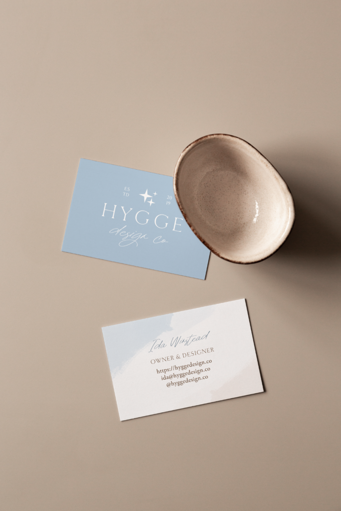
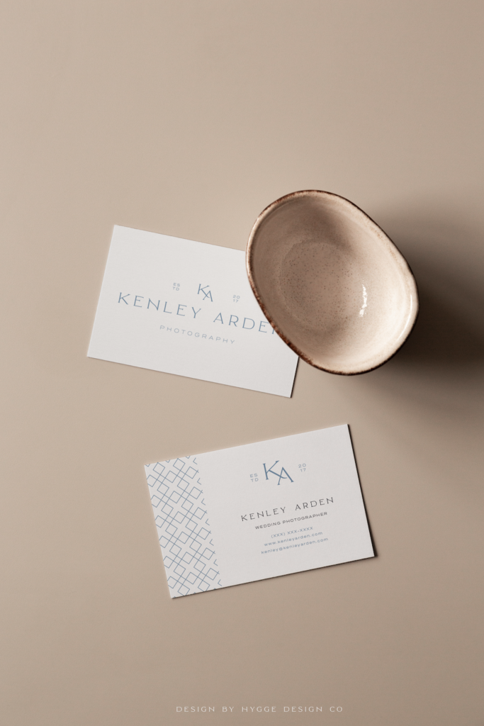
Here are a couple of ways to use patterns in your stationery and business cards:
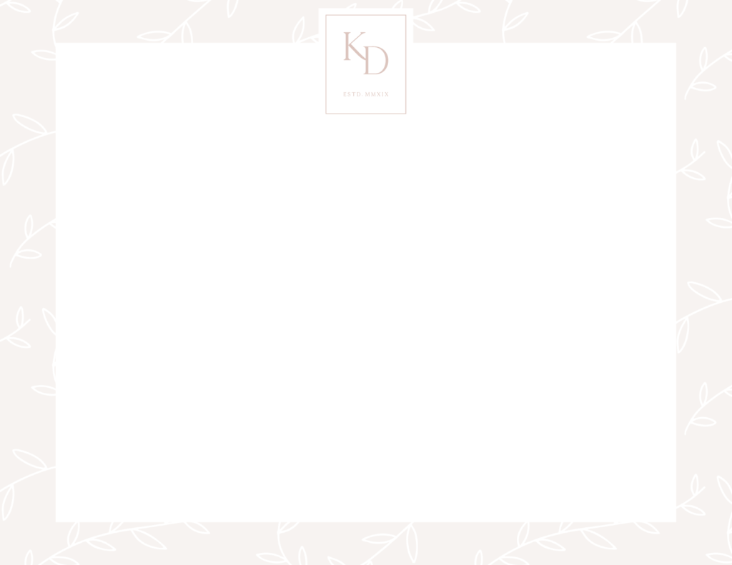
Desktop and Mobile Navigation
This may be one of my favorite little ways to use patterns.
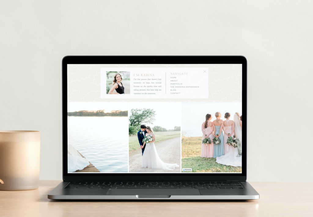
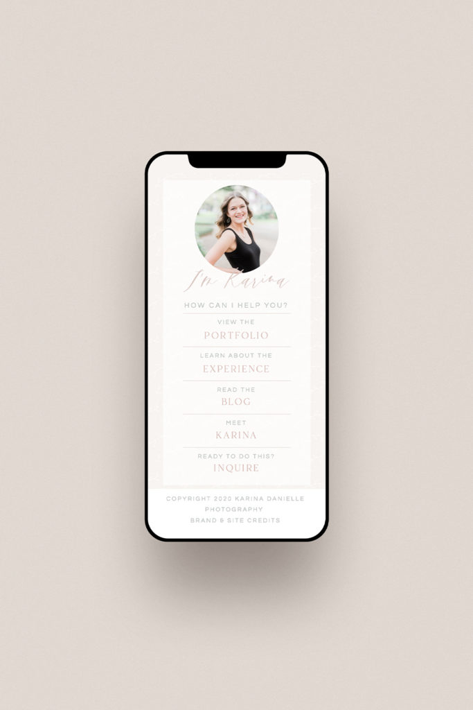
Karina’s brand is such a gorgeous, feminine brand, and to best bring that over to her website without it feeling too pink or too girly, we incorporated her brand patterns to create that elevated look.
I’m so excited about the final result of this, and I think this is the perfect example of how you can incorporate brand patterns in a subtle way to make a big impact.
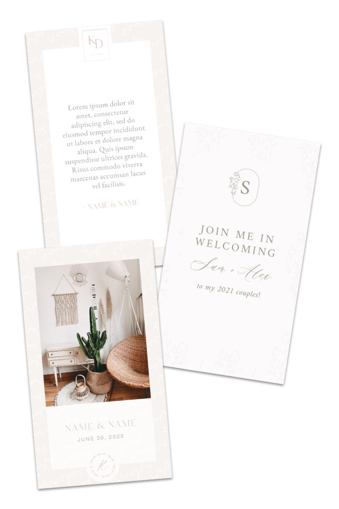
Instagram story
A classic example, this is another one of my go-to’s for my clients during their brand presentations. Again, the patterns here really take it to that next level in a subtle, yet impactful way.
Tissue paper
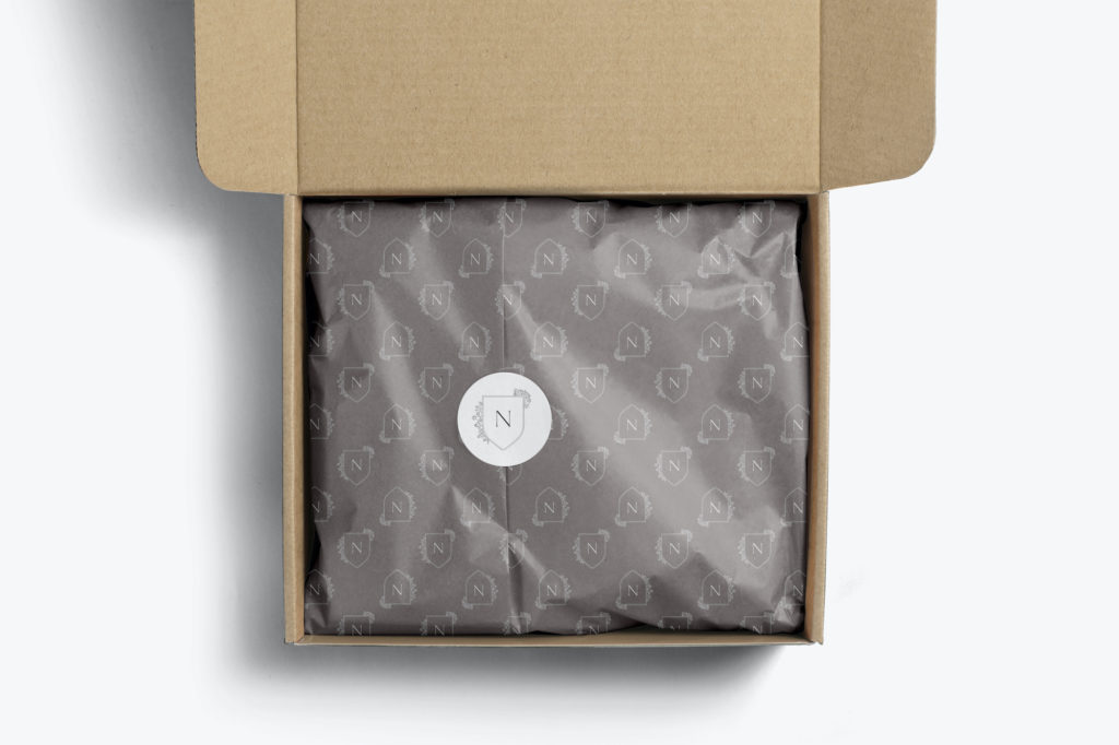
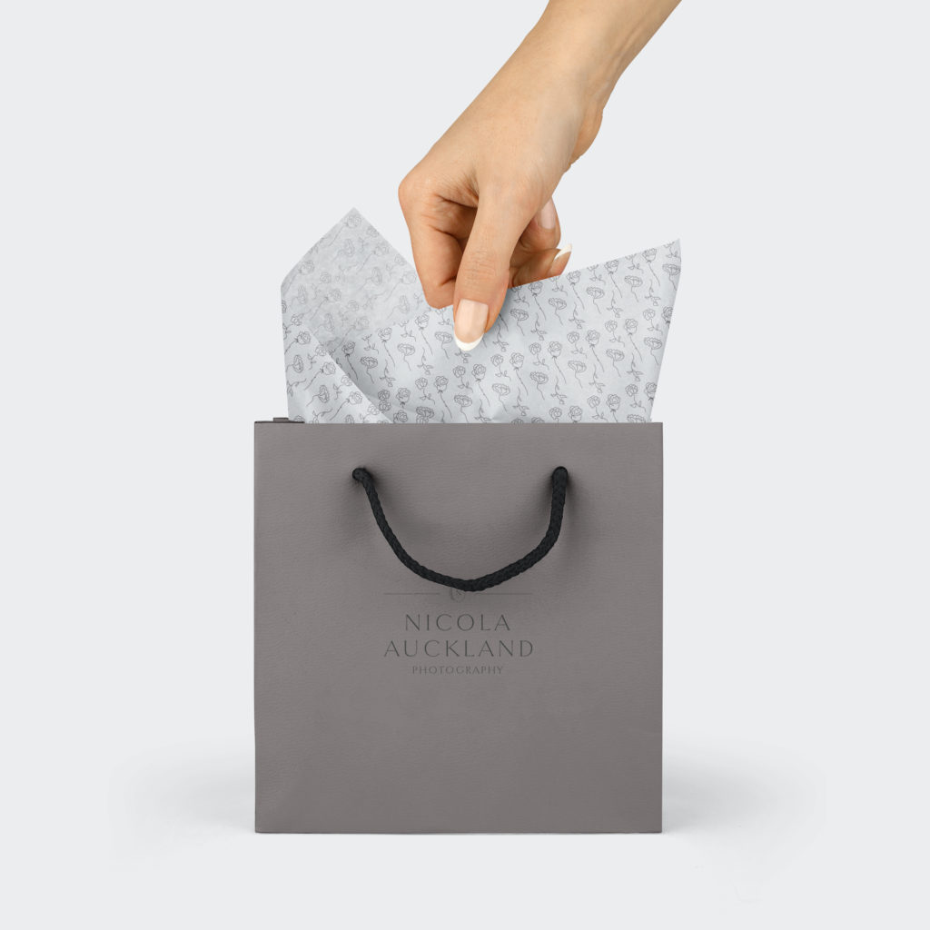
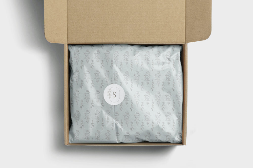
For a lot of my wedding photographer brand clients, incorporating printed materials like shipping boxes, tissue paper, and stationery can be a key part of creating that luxury experience for their clients.
Just look how incredible this tissue paper from Noissue* looks:
Website section backgrounds
Last but not least: the website section backgrounds.
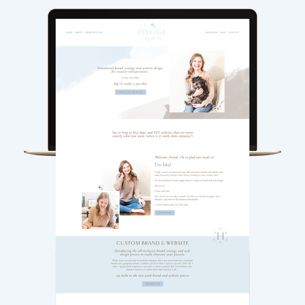
This is something that I’ve actually incorporated into my own site, to help set the tone and create that experience from the moment someone lands on my site. The key here is to not be afraid of playing around with opacities. Your pattern or texture doesn’t necessarily have to be front and center, but if you allow it to play that support role in your website design, it can truly make a huge difference.
If you find that it looks too busy with your pattern, try adding a white box over it to use the pattern on the sides only, or lowering the opacity even more!
Looking for help elevating your brand? I’d love to work with you to make that a reality! Learn more about my services and how we can work together here!
