I was thrilled to be able to work with Taylor on this brand strategy and website project. It is so evident that she has spent a lot of time and effort growing her photography brand and business, and it was time for her visual identity (logo, colors, and website) to match up!
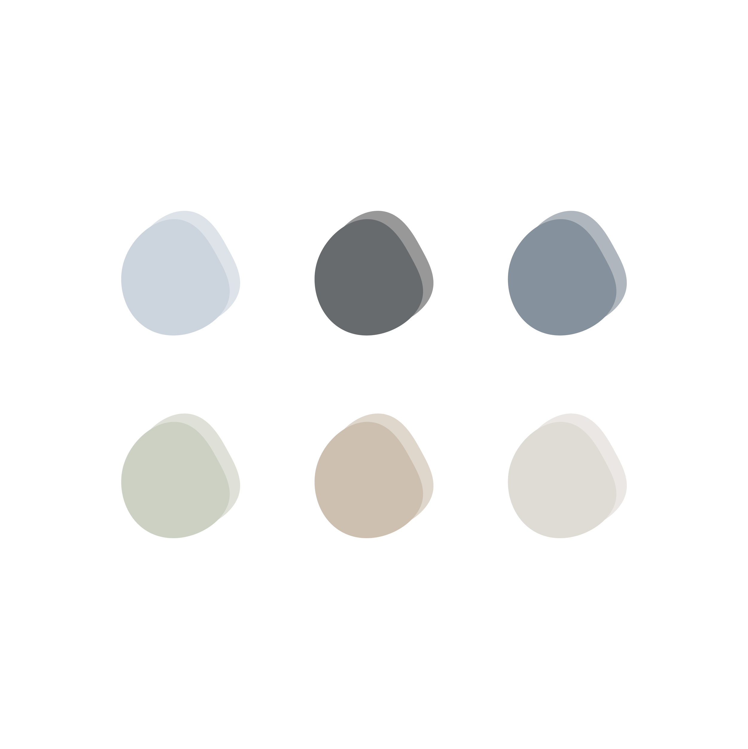
She reached out to me explaining that all she really cared about what is incorporating some dusty blue. It is her absolute favorite color, and a quick scroll through her Instagram makes this really evident! While she didn’t have a consistent brand at the time, she had already spent enough time and effort getting known for this dusty blue color, so this move just made sense. Luckily, it also made sense in the puzzle of her new brand strategy, so we were able to keep it!
First off all, let me paint a little picture of Taylor. She’s an incredibly hard worker. Not only does she run her own photography business, but she is also planning her own wedding, goes to school, and works in the ER! Y’all, she is a true rockstar.
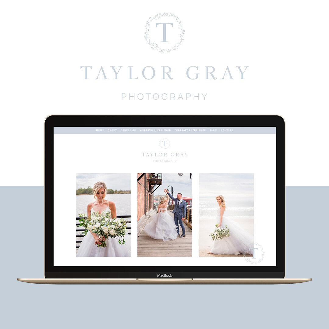
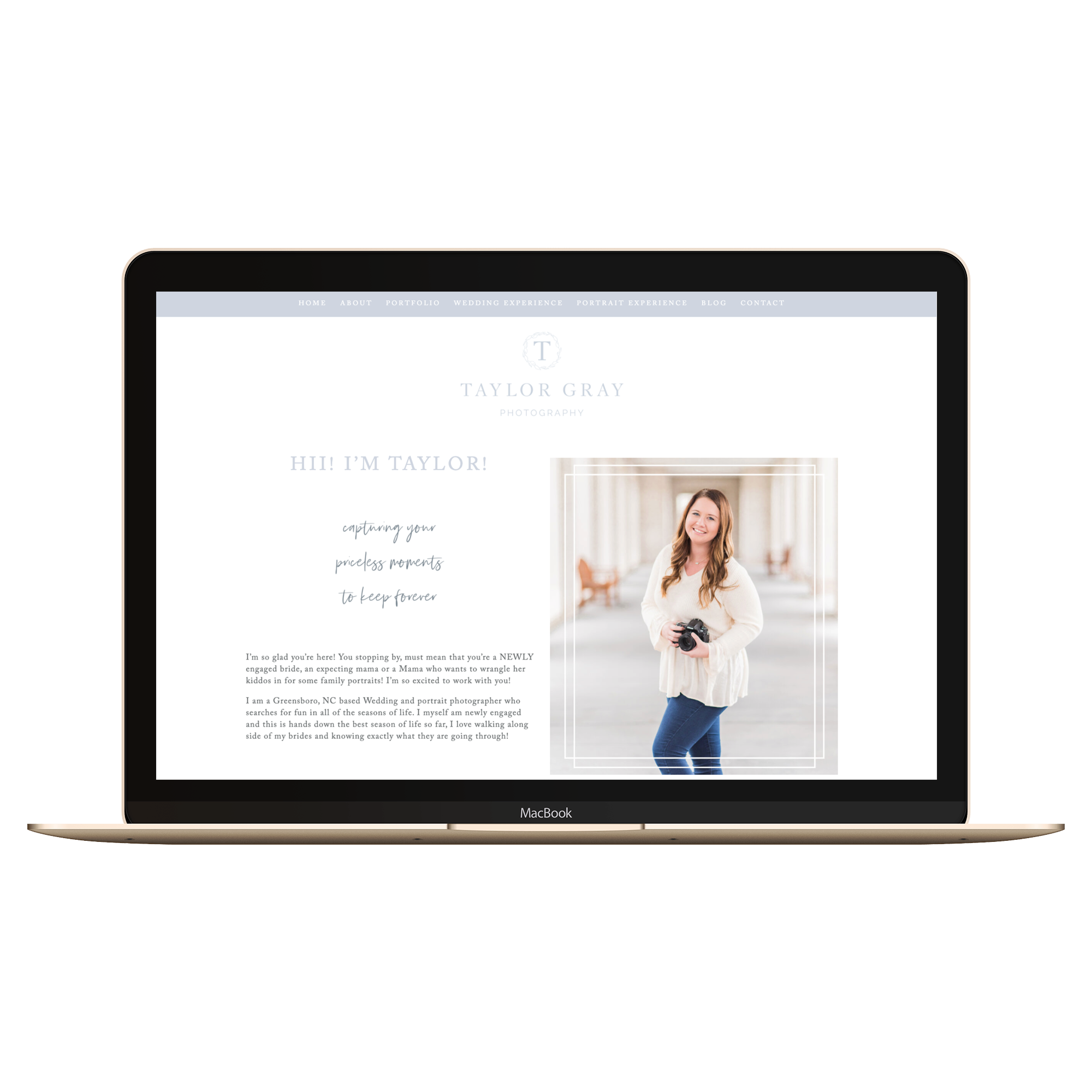
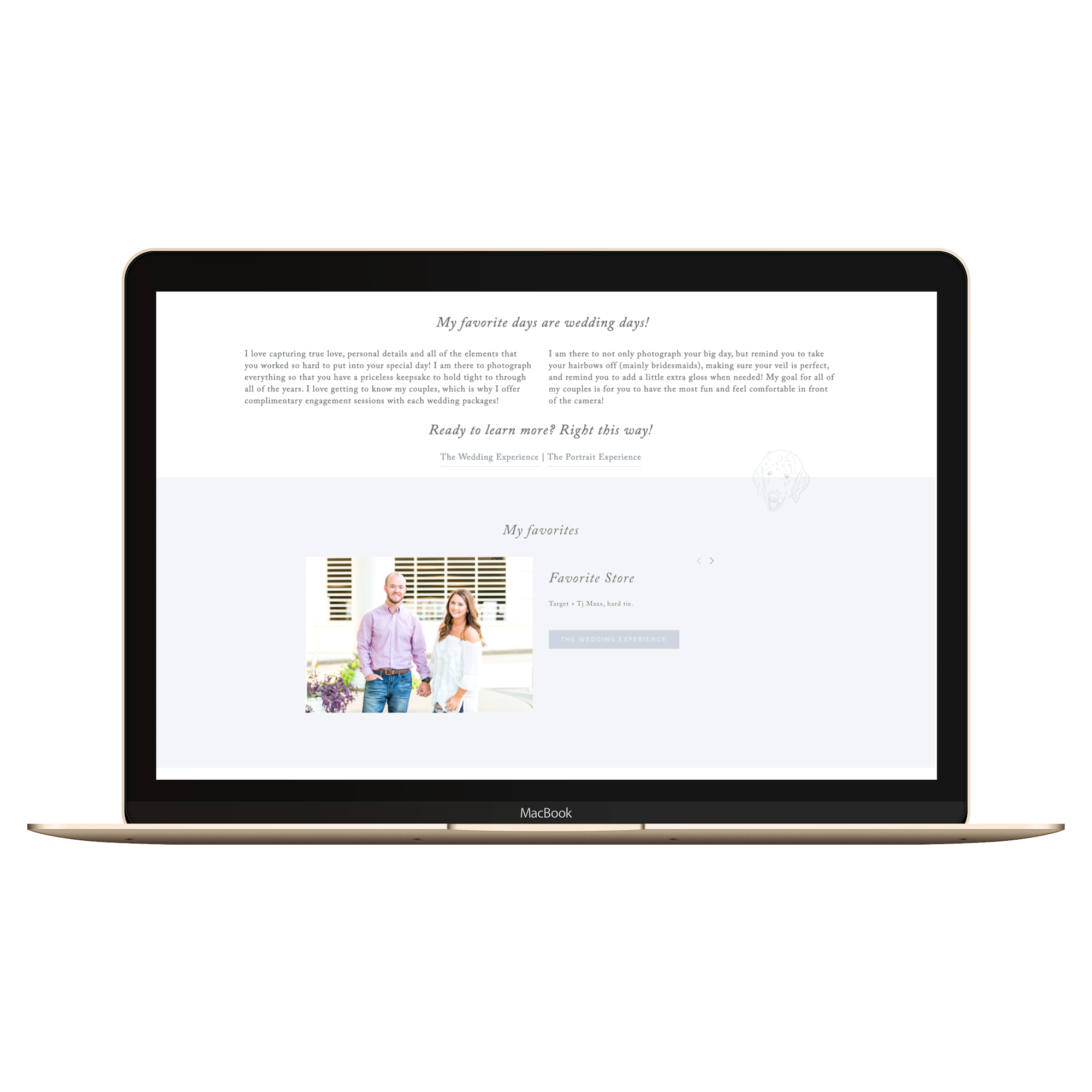
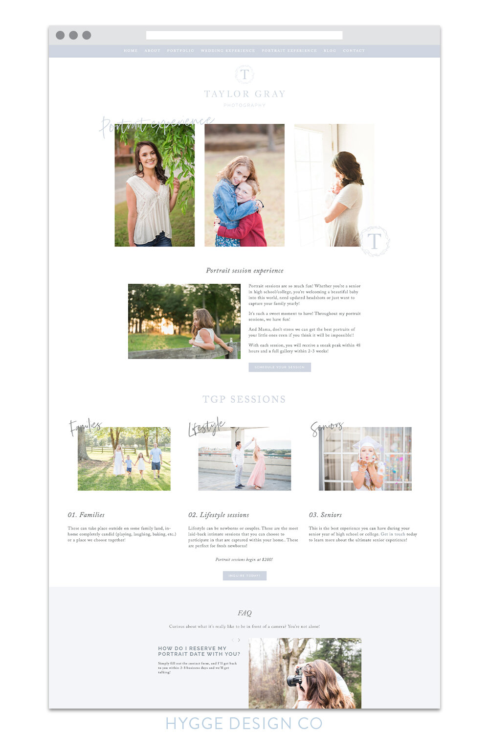
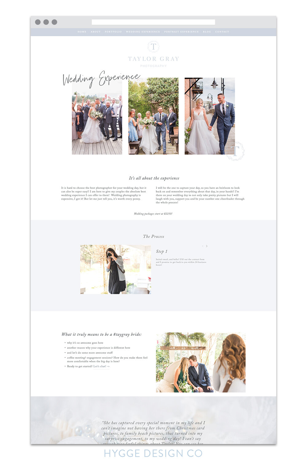
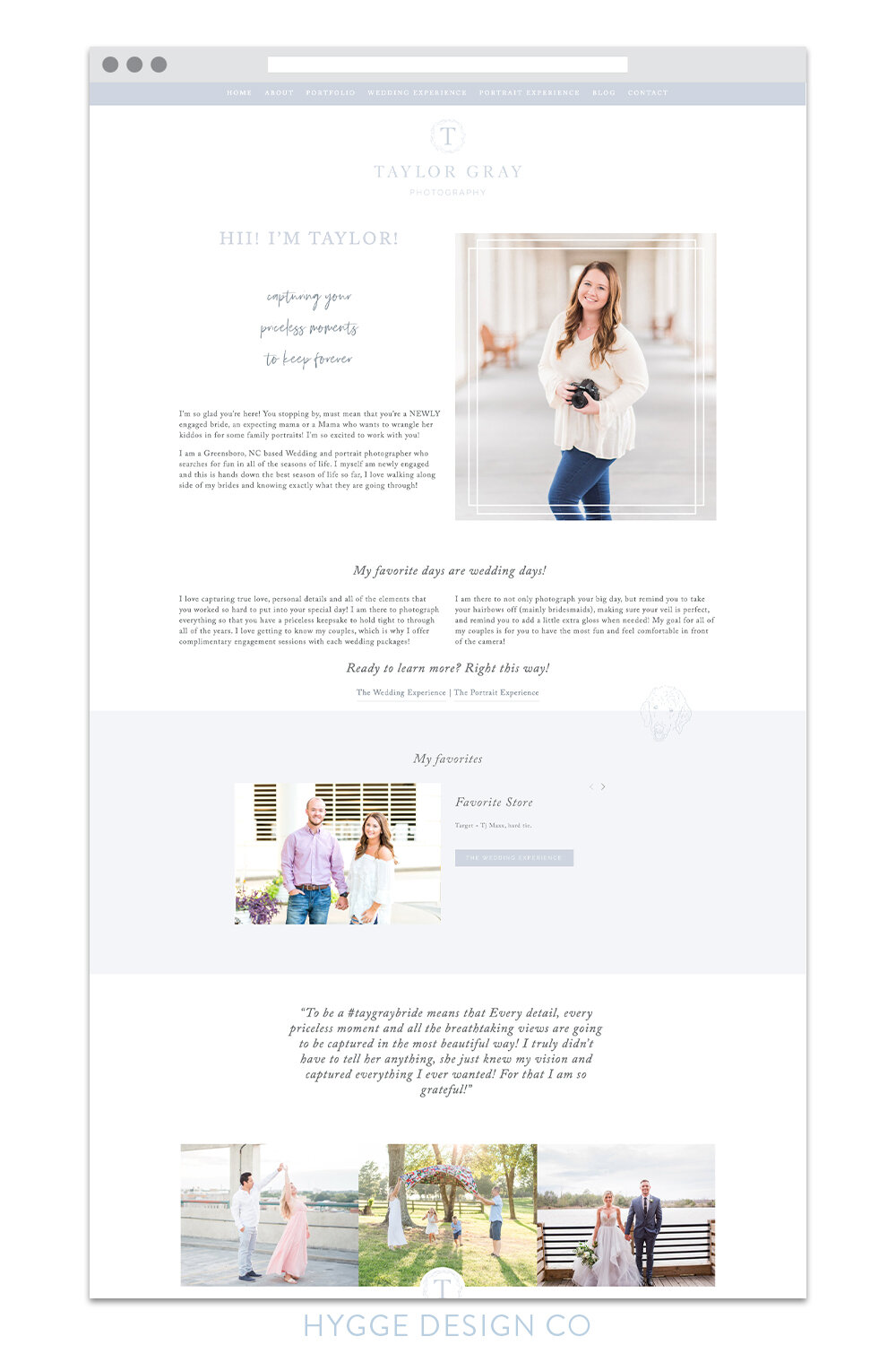
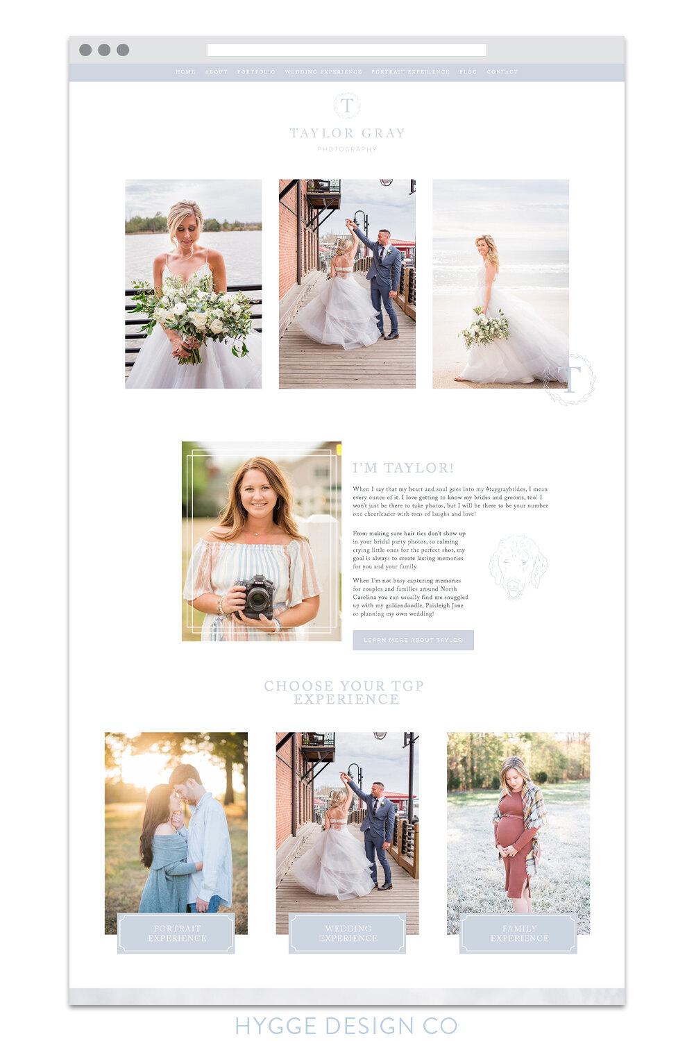
We moved Taylor over to a Squarespace website, and I have to say, I’m pretty happy with how this dusty blue dream came to life! I’m so excited to share both her new brand and website with you below.
And if you’re looking to get a refreshed look for your own brand and website, I’d love to chat! Head on over here to learn more!
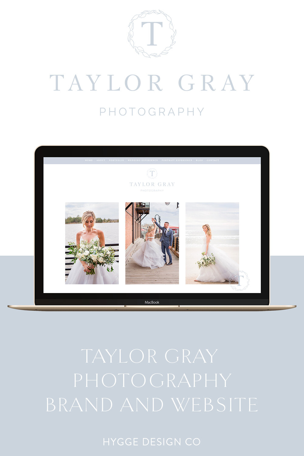
First up – the brand:
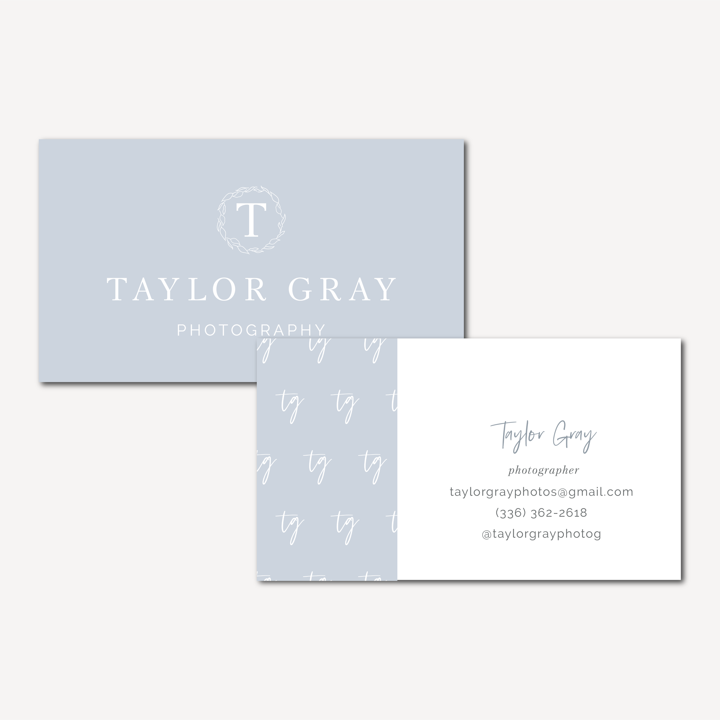



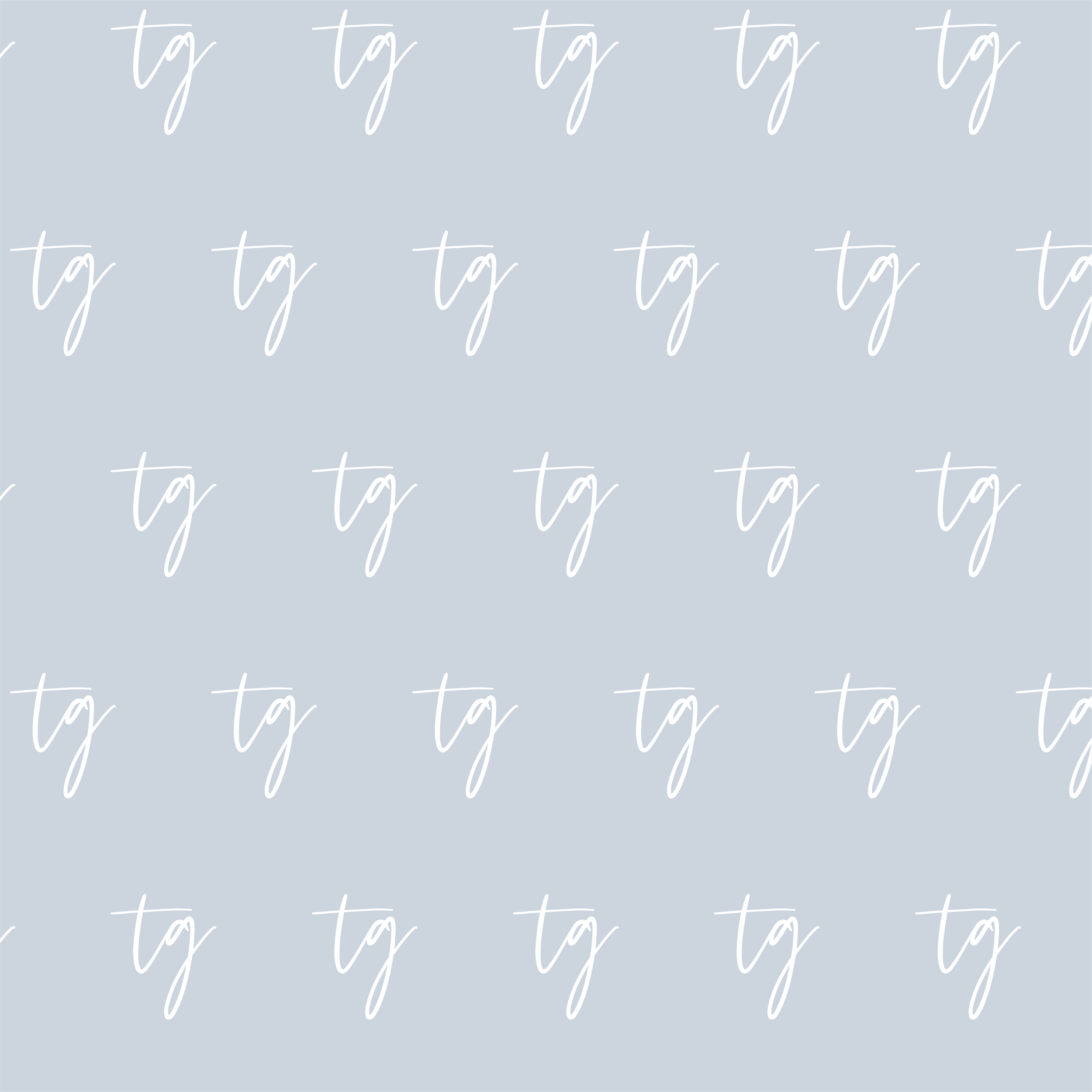
The intentional details included in this brand are incredible. Taylor’s inspiration was filled with interlocking script monograms, feminine details and florals. But she also made it very clear she wanted something that didn’t look like it came from Etsy – perfect! Exactly my kind of photographer.
One of my favorite parts of developing a brand strategy is listening to both what my clients are saying and reading between the lines. It is my job as the designer to interpret what my clients are saying and creating something that still fits with their ideal audience. Ahh, such a fun challenge!
Next, we took the beautiful new colors, fonts, and other brand elements to build out this beautiful website that really represents her skill and passion well.
the website:
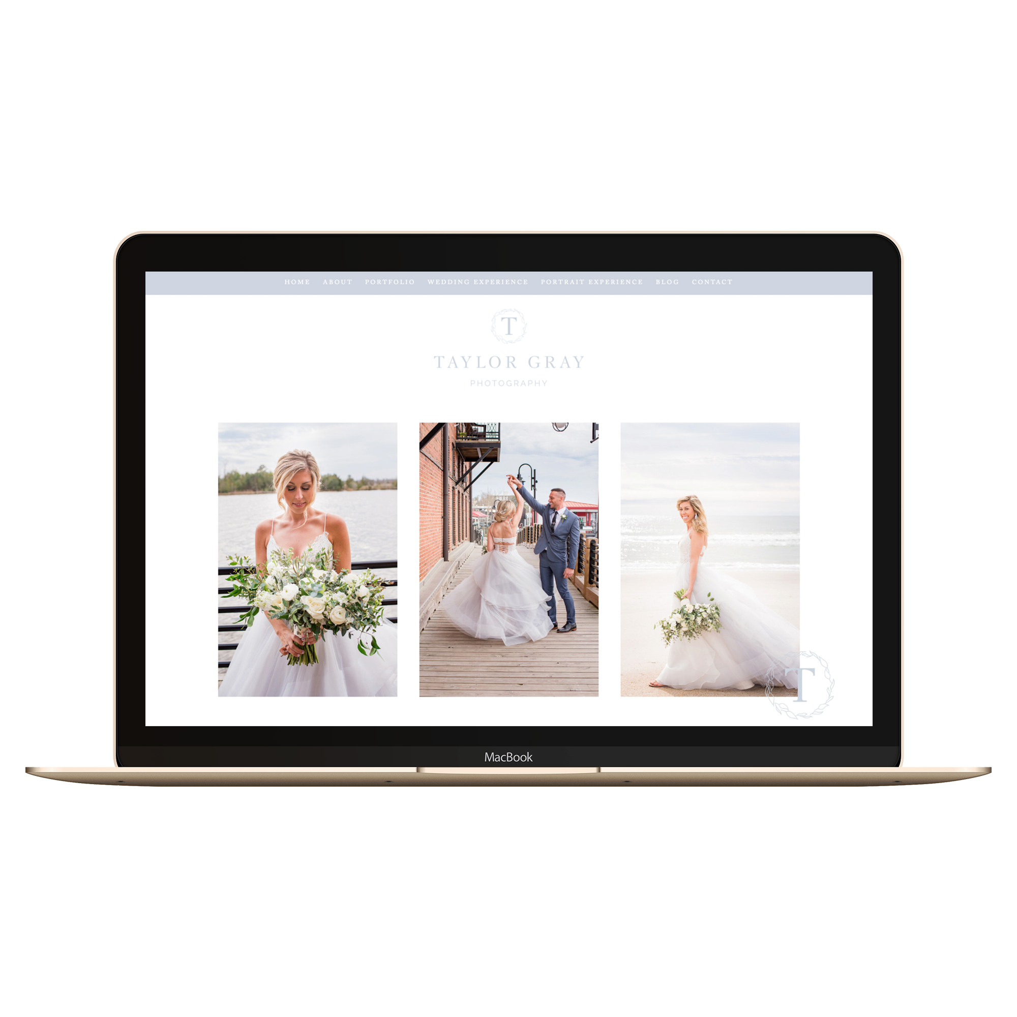
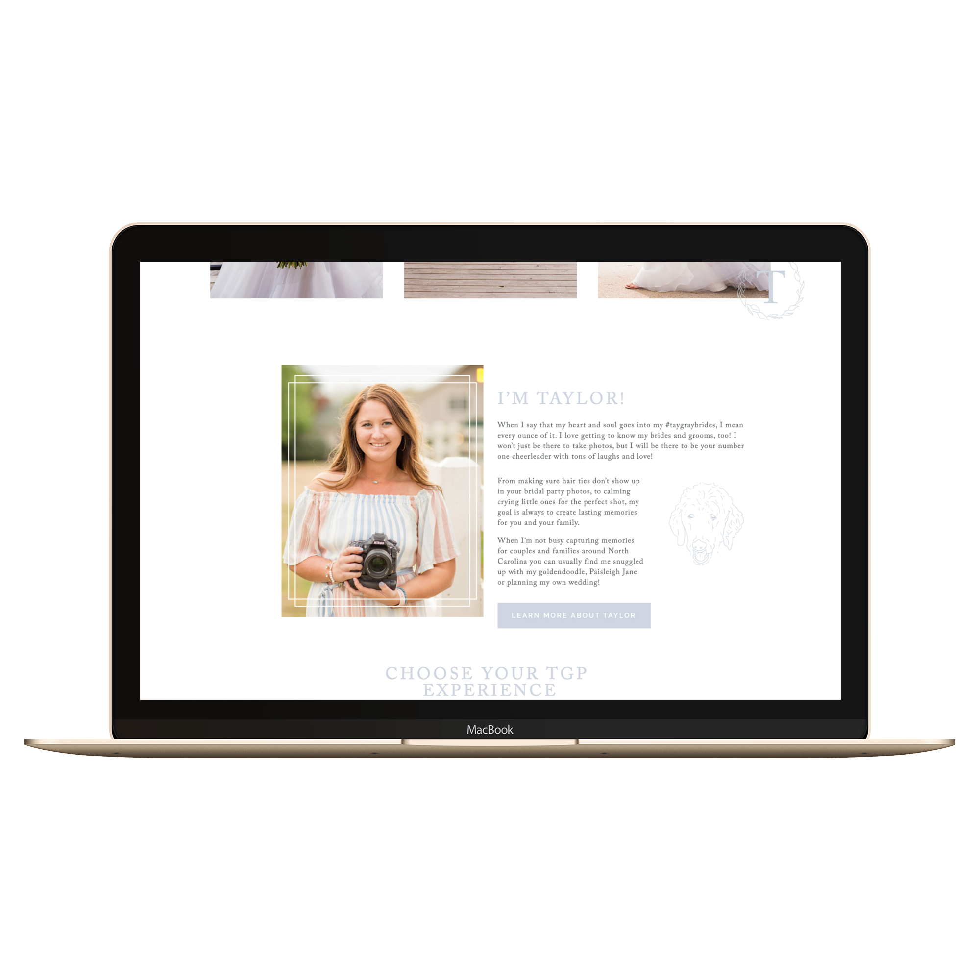
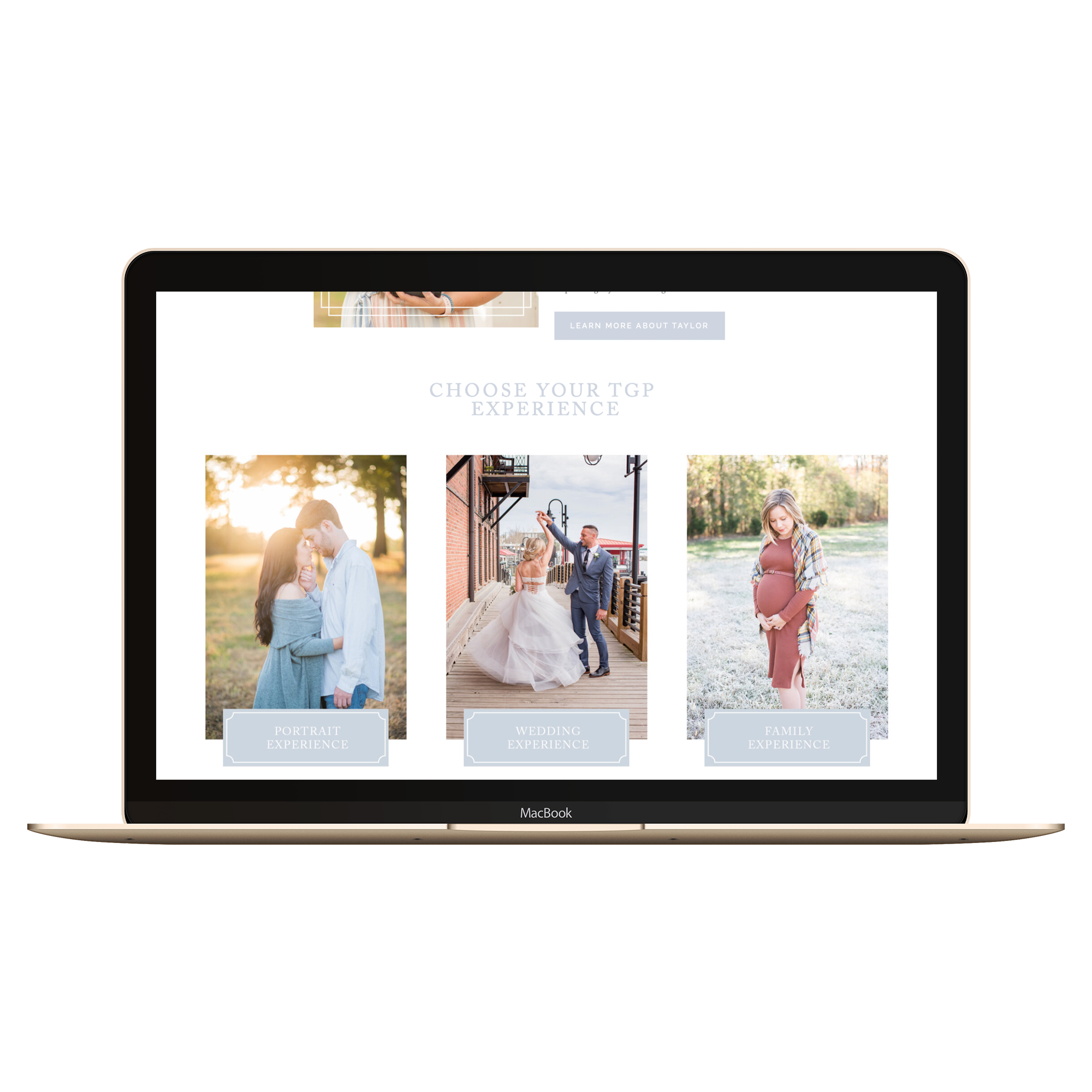
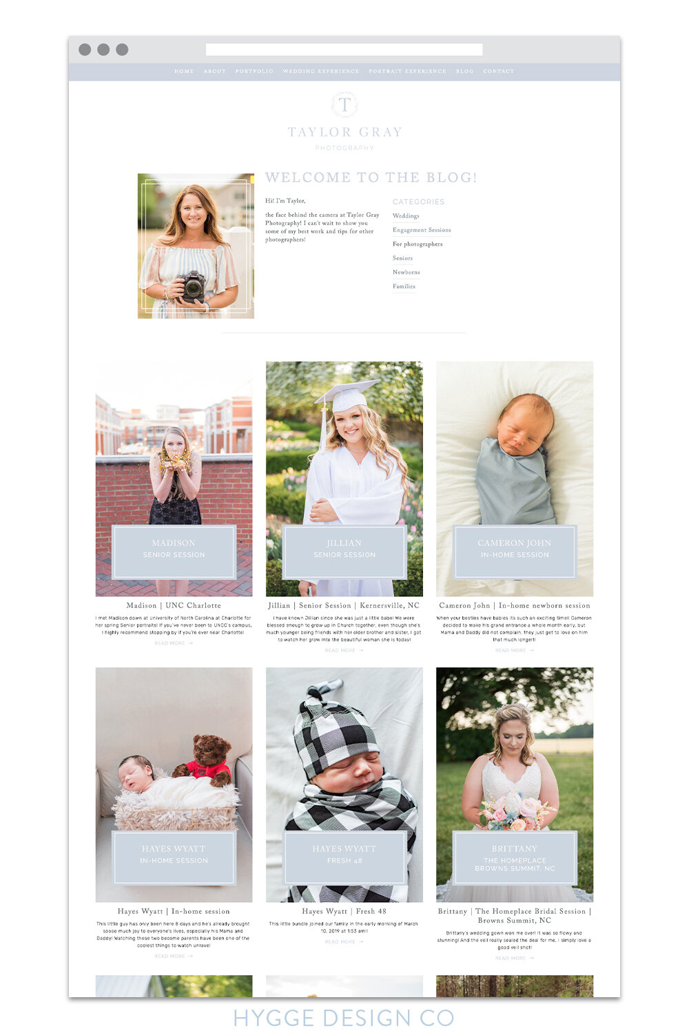
just take a final look at how well it all comes together:
Now the real question – are you ready to get a refresh on your own brand and website? I’d love to help! Learn more about working with me:
You may also like: