Not quite happy with the way your blog page shows up with your current SquareSpace template, but you love the rest? Don’t worry, there are so many ways to style your SquareSpace blog pages so that you can get the blog of your dreams. My own blog page is a prime example of this, just see the before and after below!
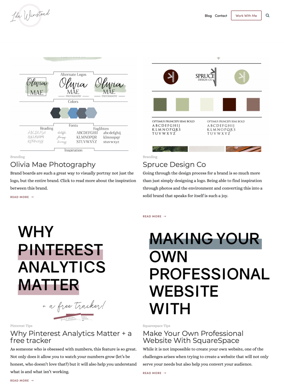

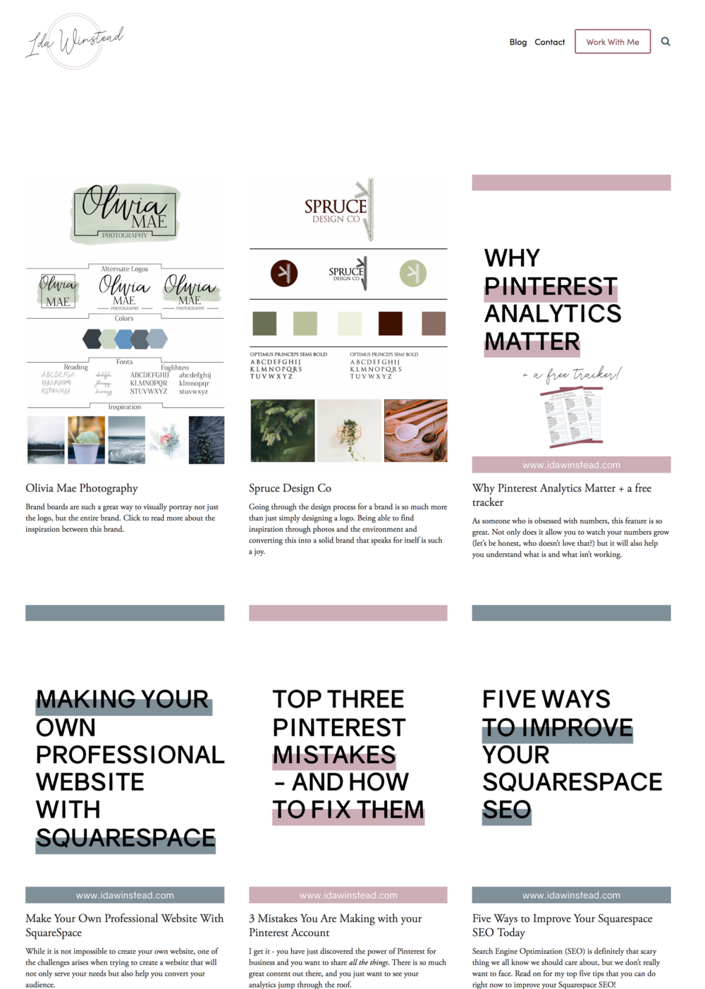

Of course I wanted the entire graphic or preview image to show when you scroll through my blog page, and I was able to get this exact look using the Summary Block. Read on to learn how I use the Summary block to style SquareSpace blog pages.
Moving your blog to the unlinked section
The first step in styling your blog differently than the template is moving the actual blog (where you write your blog posts) to the unlinked section of your website. Don’t worry, we will make sure it is easily accessible for anyone wanting to read!


Creating a page in your linked section (or wherever you want your blog to be located)
Now create a new page in your linked section (or wherever your blog used to be located). You can start this off with just a plain page like below, and then we’ll get into how to actually style it!


Setting Up the Blog Page
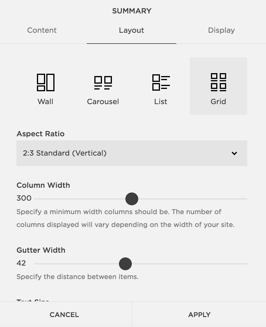
Next we’ll use the Summary Block in SquareSpace to pull from our blog posts. On the new blog page, insert a Summary Block. In the content section, decide which blog you want the content to be pulled from. Then, you can go to the layout and display options and play around with those settings until you are happy with the result! You can see my settings below



Alternatives for categories and tags.
If you add tags or categories to your blog posts, and don’t want all your posts to be visible on the blog page in your menu, you can choose to only pull from specific categories or tags (this can be found in the display tab of the block). This feature can also be used to add in “Similar Posts” blocks at the bottom of all your blog posts, or to showcase specific topics throughout your site. Play around with the Summary Block to learn more about this super powerful tool!
If you’re looking to work with a web designer to create a stunning & strategic website for your business, look no further! I help creative entrepreneurs in the wedding industry create beautiful websites that help you stand out from your competition and communicate your value.
Sound good? Stop by the services page, and let’s get started!
You might also like
