Last week on the blog we went in-depth into the pros and cons of Showit vs Squarespace so you could feel more confident making the right decision for your own business.
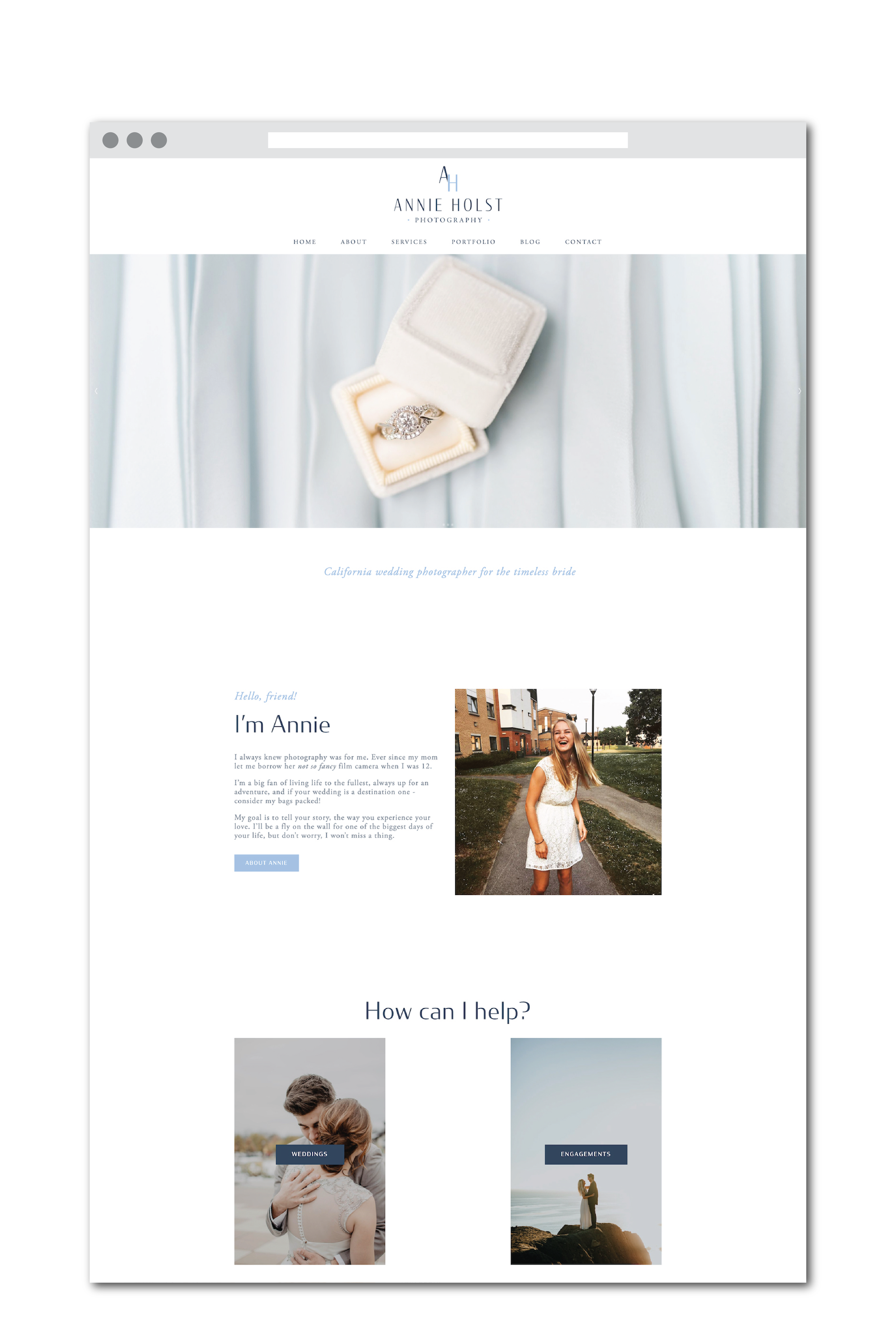
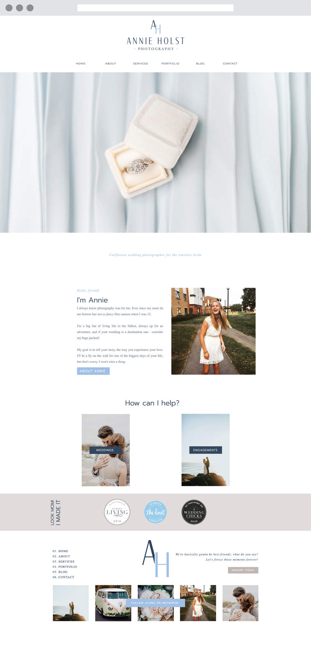
Today, we’re taking it one step further! In this blog post we’ll dive into a case study where I created the same website for Annie Holst Photography with Squarespace and Showit to give you a better idea of the possibilities with both platforms.
Let’s dive in!
Showit vs Squarespace:


Showit Website


Squarespace Website


Showit Website


Squarespace Website
As you can tell, there are hardly any differences between the two websites.
It is worth noting that it is a lot easier to add custom fonts to Squarespace (and you also have more font options) than you get with Showit. For the Annie Holst photography brand, the brand fonts were already included in Squarespace, while I found similar fonts to use in place on the Showit site.
Which one’s your favorite? leave a comment below, I’d love to hear your thoughts!
If you’re looking for your next website, you’re in luck! I’m a Squarespace web designer (and Showit designer), and I’d love to help you create the website of your dreams! Get in touch today to reserve your spot in my design calendar!
* this is an affiliate link, which means I may get some benefit at no extra cost to you!
you may also like


