How many times have you thought to yourself that these brand colors you’ve got going on might not fit your brand?
And let’s not talk about all the times you’ve tweaked your color palette.
I remember working on a smaller design project for Madalyn Yates Photography. She simply needed some opt-in freebies designed. I knew one of her brand colors were pink, but really didn’t know much more than that. So, in an effort to create on brand freebies for her, I asked her for some more details, and the conversation went a little like this:
“What shade of pink is your brand color?”
“Oh, pink.. Whichever one I find in Canva that day”
What was supposed to be a quick opt-in freebie project quickly turned into a branding lesson, and may or may not have been the start of the rebranding process for Madalyn Yates Photography.
While this was an educational time for her, it was also a real wakeup call for me. It made me realize most creative entrepreneurs don’t actually have strategic brand colors in place.
A lot of newer business owners know that they need brand colors, so they head to Canva (or Pinterest) and create a pretty moodboard and choose colors they love. During this process, it’s easy to forget how these colors need to be used, and what you even need to consider to create strategic color palettes.
I’ve seen it countless times in Facebook groups where entrepreneurs post photos of their newly crafted moodboards and color palettes, but they truly can’t explain why they chose the colors they did. Most of the time it has to do more with their favorite colors, rather than what truly represents the business well.
Today, I want to give you a little look behind the scenes of how I create color palettes for my own clients at Hygge Design Co.
In this post, I’ll show you three simple steps to how you can strategically craft a color palette to represent your brand and business!
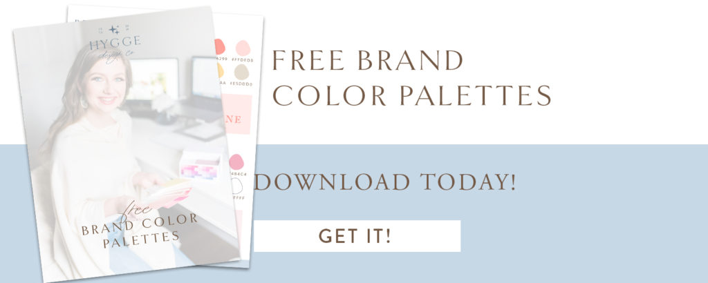
And to make this process even easier for you, I’ve created a free guide with 7 curated color palettes to get you started. Grab those here:
Step 1: Gather inspiration for the aesthetic and determine keywords
Any time I create a color palette, whether it be for a client or just a creative project, I love starting with inspiration for the way I want this brand to look and feel.
It’s important for me to create color palettes that match the emotions or aesthetic of the project, rather than focusing on incorporating specific colors, or just choosing random colors that look nice.
To do this, it’s important to use a combination of your brand keywords and inspiration images. I typically allow my clients to gather their own inspiration at first, and then I supplement with images that I think fit what they are looking for.
By focusing more on feelings rather than the actual color palettes, you’re able to create a brand that really aligns with your values and brand, which is the key to long term brand success.
How to gather inspiration:
Here are the simple steps I take to start gathering inspiration for my color palettes:
- Gather a list of the brand keywords. If you’re not sure what your brand keywords are, head to this post to work through that exercise to get started with solid brand keywords that align with your brand and your ideal clients.
- Create a Pinterest inspiration board. Pinterest inspiration boards are great to create a visual of what you want your brand to look and feel like. I prefer to pin a large variety of images ranging from font inspirations to interior design and lifestyle images. Below is an example of what that looked like when I redid the Hygge Design Co brand aesthetic earlier this year. The keywords for this project were inviting, minimalistic, hygge, and cozy neutrals.
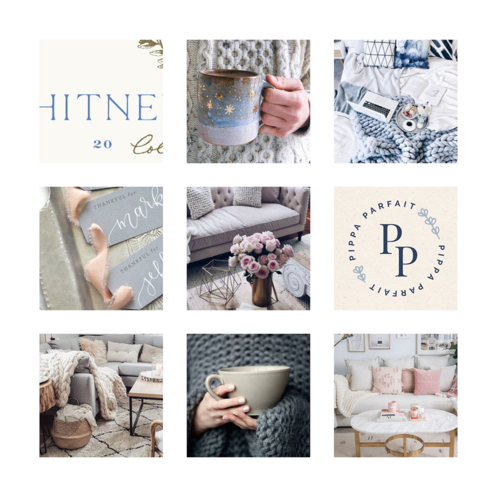
As you’re looking through the inspiration images, make sure that your keywords actually align with the visuals you’ve gathered. For example, if I had been pinning a lot of bright images, beachy vibes, or even dark and moody style photos, this would have been a great time to do a little check-in to see where the disconnect is. Did I choose the wrong keywords? Am I focusing too much on my own preferences and forgetting my ideal client?
Once you’ve got the inspiration images and keywords all figured out, it’s time to move on to step two!
Step 2: Figure out your primary/ main brand color
The next step in this process is to decide on your main, or primary brand color. In some cases, this might be where your current brand identity gets to live on, or you may have parts of your brand story that needs to be told here. This is also the part where you need to be aware of color psychology and how that plays into the feelings your audience has towards your brand.
When we created Madalyn’s brand identity, we knew going into the project that pink had to be her main color. Pink is known to be delicate and feminine, which is very fitting for a photographer like Madalyn. The tricky part then became finding that perfect shade of pink that worked with the direction we wanted to go for the rest of the brand aesthetic.
Taylor, from Taylor Gray Photography had a similar request when we started her brand project. We had to incorporate dusty blue in some way.
Luckily for both Madalyn and Taylor, the color they requested worked perfectly with their overall brand and the keywords we were working with; however, don’t be afraid to explore other options as well if those might work better for your new brand.
How to use color psychology in your brand:
As you’re just starting out with color psychology, it really doesn’t have to be too difficult. Once you have a primary brand color in mind, head to Pinterest and do a quick search for XXX color psychology. You should see several graphics pop up with the specific color explaining some of the main keywords associated with this color.
Compare the list of keywords associated with the color with the keywords you want associated with your brand.
Are they similar? Do you feel like they evoke the feelings you were looking for?
At this stage of the process, it’s extremely important to be honest with yourself. If you’re set on burgundy as one of your brand colors, and it truly doesn’t make sense, try to come up with something else. This doesn’t mean that burgundy has to be completely out, but it may need to play a smaller part than you planned for.
It may seem like you’re walking away from the brand that you love, but I can promise you that listening to the keywords (and your ideal clients) is going to leave you with a lasting color palette, rather than one that works in a short season.
From personal experience, I know that ignoring these signs will leave you right back here in a couple of months, more frustrated than before because the colors don’t work.
No idea where to start? Don’t worry! Use the free brand color palette guide below to get started:
Step 3: Determine your secondary and accent colors
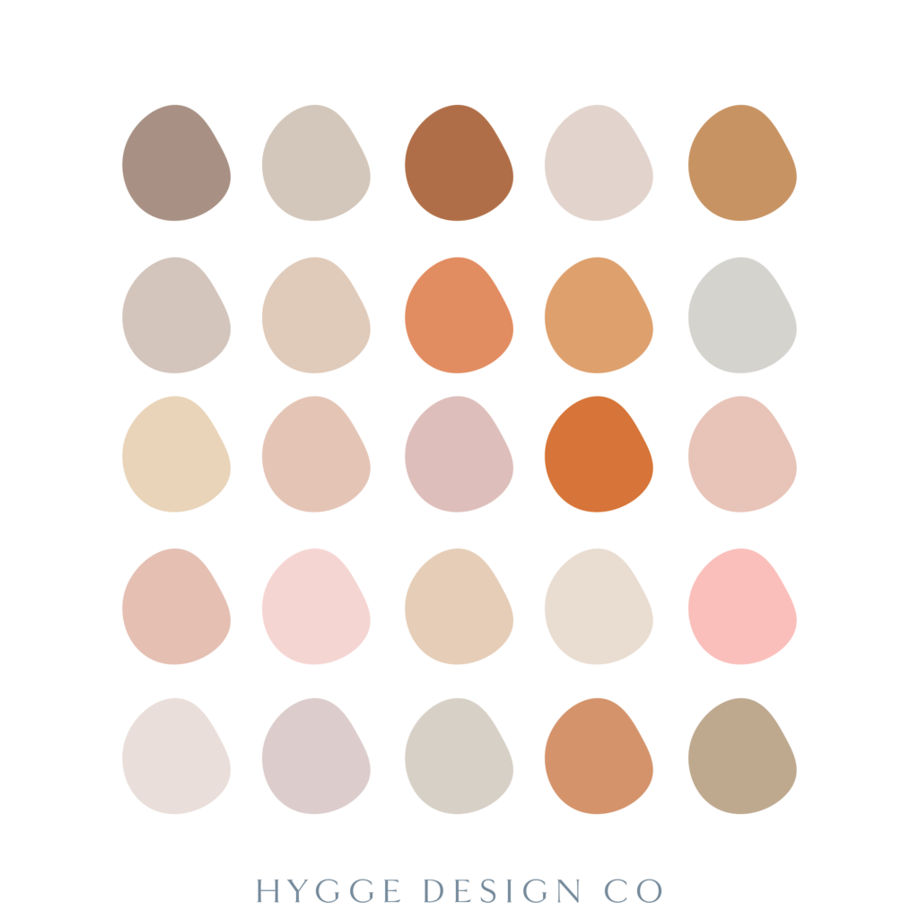
Once you have your main color selected, it’s time to determine the other colors in your palette. I typically curate palettes with 6 colors (but I have done 7 as well). You don’t need to include 10 different colors for this to make sense, as less is often more 😉
My color palettes are typically broken down in two:
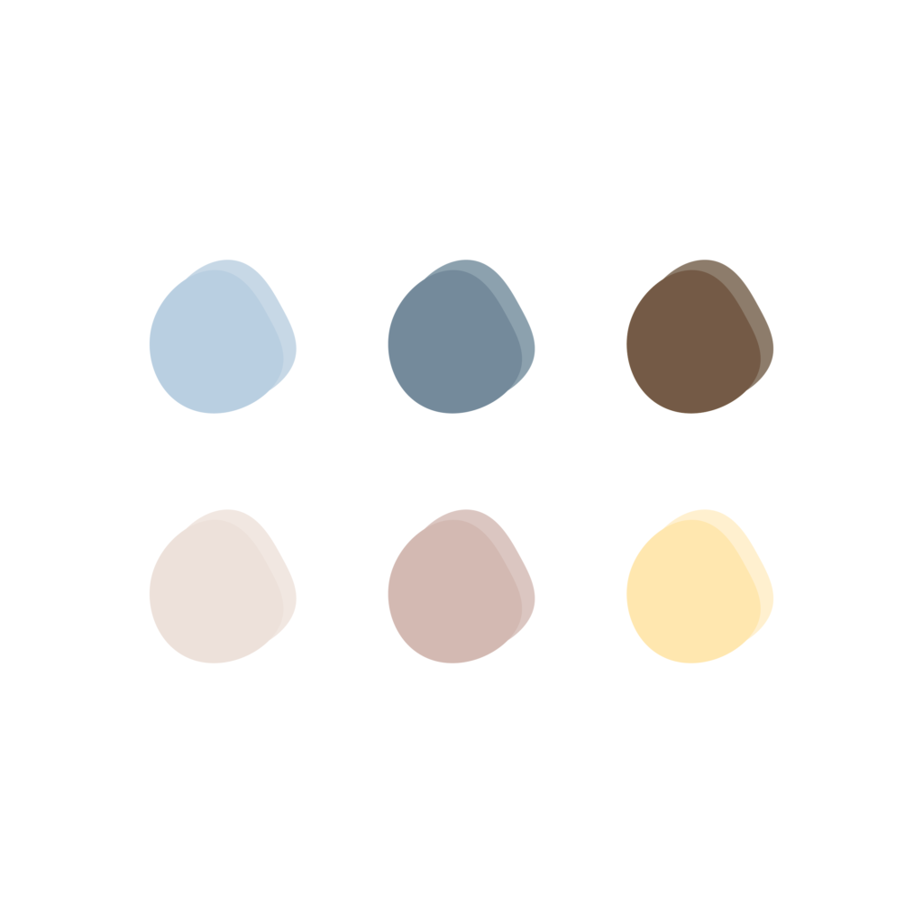
The top line are the main colors that should be used for the brand. For Hygge Design Co, this means the light blue, dark blue, and brown should always be the go-to colors.
The second line are the supporting colors. These are used to make the other colors shine, kind of like support roles in a show.
I love the way Saffron Avenue breaks down the structure of the color palettes, and use a similar approach in my own designs.
For Hygge Design Co, I started out with
2 main colors: light blue and dark blue
2 accent colors: dark brown and yellow
2 neutrals: beige and taupe
This provides great versatility for the brand, and has allowed the light blue color to truly be the shining star of the brand!
How to find the colors:
There are a couple of ways I use to find colors for my projects, but most of them include Adobe Illustrator (this can also be done in Canva as well!).
The most important thing you need to know? I probably test more than 30 different colors to find 6 that I actually like.
To do this, I typically use Adobe Illustrator’s color guide and the eyedropper tool.
Remember that moodboard you created earlier? Are there any colors there that stick out to you that you can use? Try to create a bunch of different color options so that you can see a good variety at first, before you start narrowing down.
To see the final result of all of these different colors, grab the free color palette guide!
For example, for the Hygge Design Co main blue color, I actually used the eyedropper tool on a photo of my eyes.
Yep.
Why? Because my eyes are the number one thing people comment on when they first meet me, they assume I’m scandinavian, and it truly fits with that Hygge vibe (and helps people remember my connection to the brand!).
Don’t forget to consider the color psychology behind your supporting colors and how it all comes together as well.
Test your colors:
Once you think you have your color palette nailed down, it’s time for the real test.
I like to run a little test call the “button test”.
It’s fairly simple, and the purpose is simply to make sure that the colors can actually play nice together, not just on their own.
Simply create fake buttons (or just rectangles if you will) in whatever program you’re using, and place text on top. Play around with your various colors to make sure that you can in fact read the text when you use a combination of your colors. Just like so:
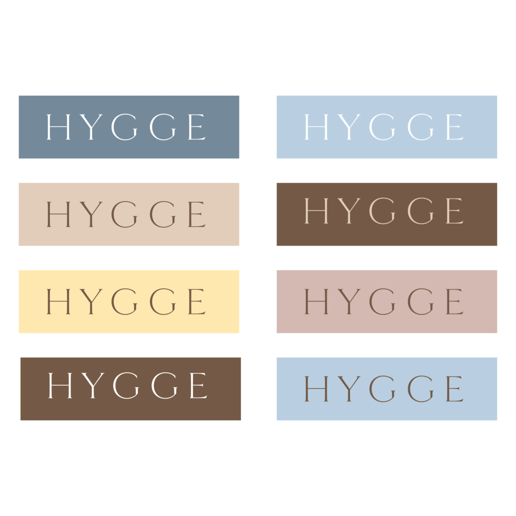
Once you feel confident that your colors look good together, play nice with each other, and also fit with that brand aesthetic you’re going for, there’s only one simple step left! It’s time to write down all the hex color codes and put them in a safe place.
To actually build that brand recognition and the association between your brand and the brand colors, you have to start using the colors 😉
Try incorporating them in your Instagram Story captions, your website buttons, and just in general where you use color across your brand!
Don’t forget to download the free color palette guide to get you started:

Would you rather not do all this on your own? Don’t worry, friend! As a brand designer, I’m extremely passionate about helping you find colors that truly fit your brand. Learn more about how we can work together to develop a solid brand identity for your creative business today!
Save for later: