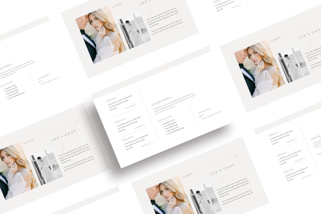
Choosing the best Showit template as a luxury wedding photographer can feel difficult. Even if you’ve decided to go the Showit template route rather than custom website, you still want it to feel elevated and easily customizable to your business.
With so many Showit website templates to choose from, it can feel overwhelming at times to know which one will be the best for your luxury wedding business, and how to make it feel your own.
In today’s blog post, I’m going to share my best tips for choosing a Showit website template for your business, to make sure you have a template that can grow with your business and truly does the heavy lifting for you when it comes to marketing.
This post contains affiliate links — that means I get a kickback at no extra cost to you if you use one of my links! I only ever share products I love and trust.

Step 1: Look Beyond the pretty
The first step in choosing a Showit template is to look beyond the pretty. This might seem very obvious, but this is actually the step where I see most creatives go wrong!
It’s easy to be mesmerized by the gorgeous template photos and the way things are styled, but don’t forget, it is just that. Styling.
We want to really take a step back and think about the various layouts, the content, and the way things are displayed to make sure you choose a Showit template that is both pretty and strategic.
By looking beyond the pretty on the template, and remembering that you can change both fonts, colors, and imagery, it is easier to focus on the strategy side of things, ensuring you’ll have a template that will grow with you!

Step 2: Focus on the core pages
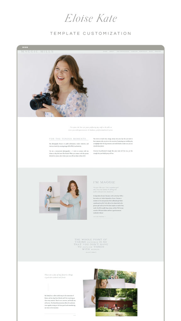
Whenever you purchase a Showit template, you’ll always need to customize it to fit your content. You truly can customize these sites as much or little as you please, but I always recommend finding a template that fits most closely with your needs. That way, you’re not having to customize as much, and it also makes it easier for you to visualize what the end result will look like.
I always recommend focusing on the core pages here — which ones include the kind of content sections you want to provide for your potential clients, and where do you see yourself making changes?
When I’m talking about core pages, I mean things like the experience/services page, blog, about page, and contact page! Things like the portfolio page is fairly easy to customize in Showit, so it’s important to not get too caught up in thinking it all has to be perfect.
Besides, changing up some things on your new Showit template is a great way to make it stand out from the crowd!
Step 3: Do your market research
I get it. You want a pretty website too. A website that feels like home. And you can actually have the same Showit template as some of your competitors. Especially if you’re customizing it well with things like custom branding, changing out fonts, tweaking the colors, etc. But, if you plan to just replace your images and copy, you may want to do a quick little search to make sure you don’t end up with the same Showit template as everyone else!
It can feel difficult for potential clients to know the difference between you and that other photographer if your work, process, and website all feel very similar.
And I’m certainly not here for priceshoppers, and neither should you be!
By carefully choosing your Showit template you can still have a website that works for you, feels like home, and looks great doing it
Step 4: Consider the source
The last thing you want to consider when choosing your Showit template is the source. Where are you getting this template from, and what are their credentials?
Before launching my own Showit template shop, it was incredibly important to me to do research, work on other templates, and do a volume of custom work to ensure that my Showit templates would not just look pretty, but also be strategically designed.
I obviously have my own design preferences and style, but I’m also considering the needs my clients have had over the past couple of years, and incorporating their feedback and concerns into my templates to ensure that they are built well.
Pretty websites are great, but they won’t move your business forward long-term.
Once you’ve found that perfect Showit template for you, it’s time to pull the trigger. Make the purchase, customize your new site, and launch it into the world so you, too, can enjoy more hygge and less hustle in your creative business.
Ready to shop the Hygge Design Co Showit template collection? Head right this way!
Curious what my favorite template shops are?
I have worked on, and recommend templates from:
- Abigail Dyer Design (code: HYGGE will get you 20% off!) – want to see her template in action? We used this one for Courtney Grant‘s beautiful motherhood photography Showit website
- Tonic Site Shop (code: IDA15 will get you 15% off) – we used a Tonic template for Megan Travis‘ beautiful brand and website!
- Elizabeth McCravy