I remember my launch call with Sweet Oak Events. We were doing a screen share so I could show her all about her new Showit website and how to update the backend, when I went to show her something on my own website.
And in that moment, I realized just how much better my design skills had gotten.
My style had been refined. And with horror, I also realized that my website was no longer a good representation of my work.
And in some ways, that was a sad moment for me.
I worked so incredibly hard on that website. I was so proud when I published it, and I truly felt like I had finally honed in on who I was as a designer, and what my message was. If you’re curious, my old launch post can be found right here!
Despite my love for my current brand, I knew it was time to elevate things. To really step into who I was as a a business owner, and the types of clients I had come to attract.
Besides, I also realized that half my offerings weren’t even on my site. And as someone who strongly believes that your website should do most of the hard work for you, that was a real problem.
So I began the process of preparing my new brand. To hone in on what it was in my head, and to build a visual identity that would match.
And along the way, I also came to terms that it was time to move on from what I had. Despite how much my current brand and website had done to get me to where I am today, I had to recognize that it was time to move on. Maybe you’ve felt this too?
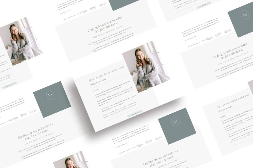
Brand Refinement
While I knew I needed a new brand, I also knew how much thought and care went into creating the brand elements last time I rebranded.
The stars felt like a part of the brand and this point. But they needed refinement.
The color palette? It was time for it to be elevated.
And the logo itself needed a breath of fresh air to connect on a deeper level.
So I started just how I start all my projects. With some Pinterest inspiration and some moodboards. But I also took a look at some of my favorite projects that I’ve done over the past two years.
Why do I love them so much, and how can I set my brand up to attract more of those? What similarities do I find, but how can I make myself stand out from that.
As you can tell, there were a lot of strategic decisions that went into this.
And a lot of time.
As someone who typically completes client projects in about two weeks, it was strange for my own project to take months. No really, I started this project in October, and it’s now June.
But I think that’s what happens when you’re the designer and client all at once. You need that time to look at it from a different perspective, whereas hiring a designer allows you to have someone to provide more of that objective perspective, shortening the time needed.
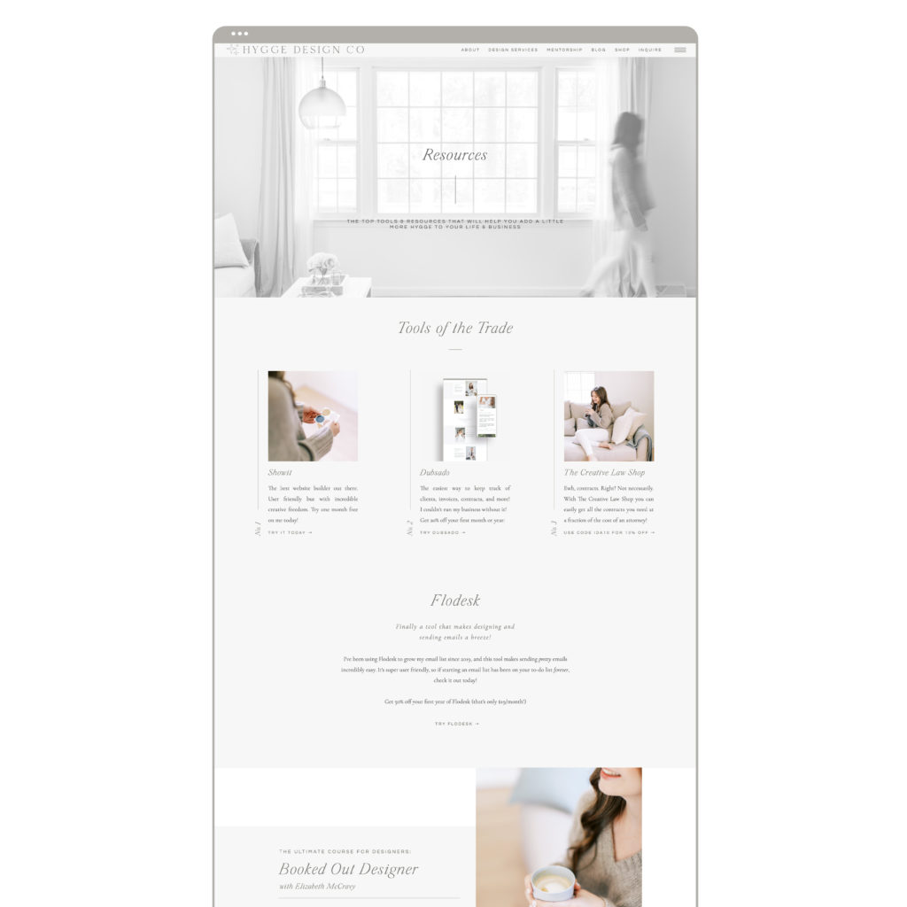
Website Development
Once the logos, fonts, and colors were all in place, the real task started. Building a new website from scratch to match the level of my clients, and to really attract the people who are for me.
To build a website that feels like home for Hygge Design Co, where I can share what I’m all about, what services I offer, and how you can work with me.
To make a complex site feel easy. To look easy. And to connect.
And to take the parts of my old message that worked, continue telling that story, and to step more confidently into the new parts. To embrace Hygge and the concept of home.
The hardest part here was undoubtedly the copywriting. Honestly, writing copy for yourself while designing (not the best idea, I know) was a true challenge. But it is also so incredibly rewarding when you finally find just the right words.
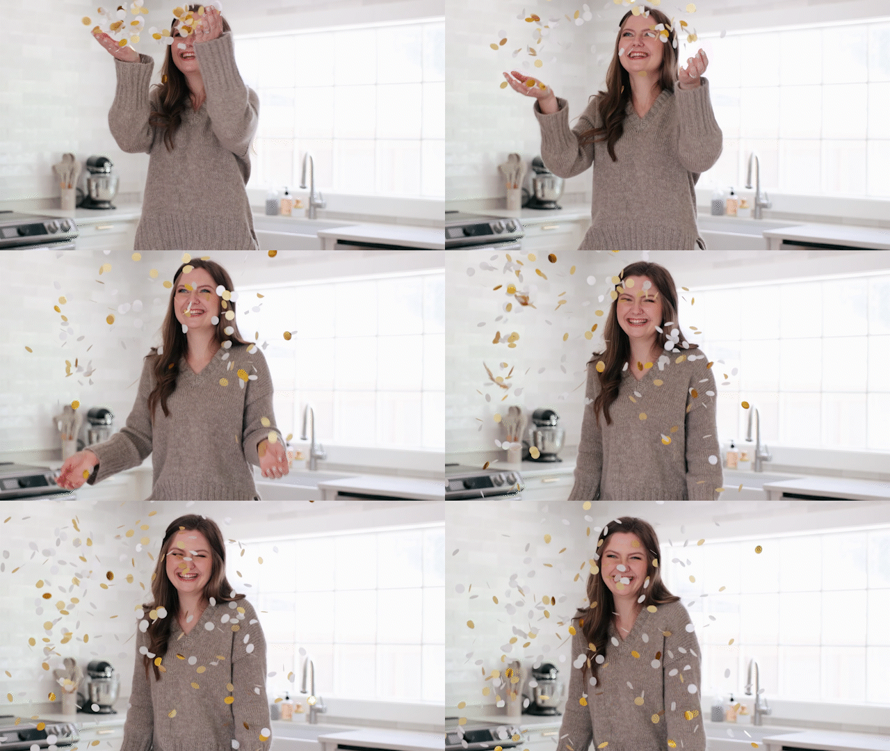
Updated Brand Photos and Video
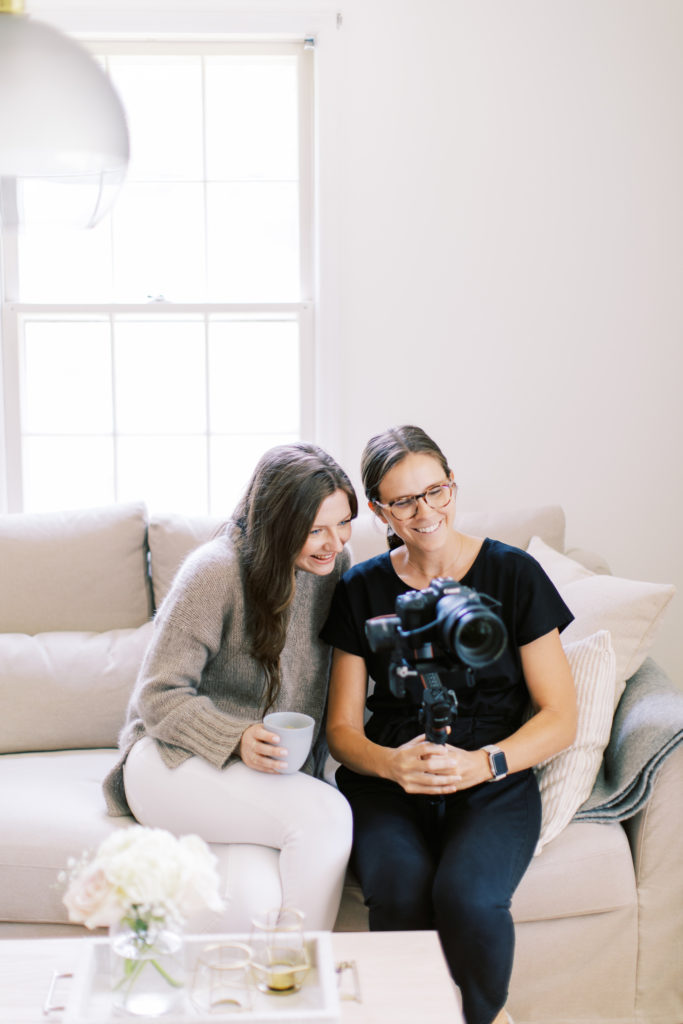
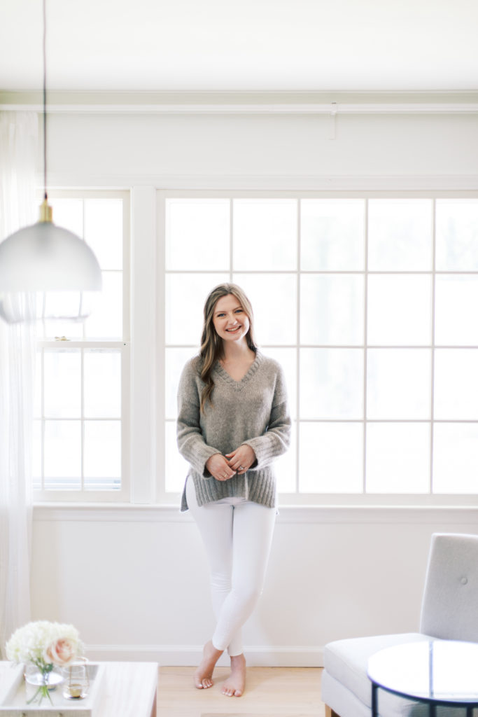
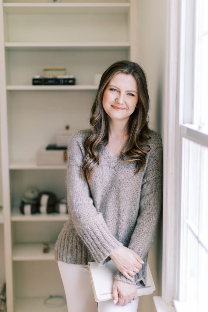
Along with my new brand and website, I knew it was also time to do a new photo/video shoot. Y’all. Amanda and Cassie blew me away with how well they were able to capture my vision.
I’ve been wanting to work with Cassie ever since we completed her new brand and website in early 2021, and I’m so glad I finally did. And Amanda’s style fit so well with Cassie’s video style that it made the entire thing seem very cohesive. Exactly what I was looking for.
Side note, if you’ve been thinking about adding brand video to your next shoot — I highly recommend!
I was able to show them the rough draft of my site, to give them an idea of the feel as well as the layouts that would need photo/video, and if I were to do it again, I would definitely do it this way.
As much as I was stressing about this shoot (yep — we totally DIYed a new desk the night before), I aslo knew that my brand was so true to me and who I am that all I really needed to do was show up & be myself.

I’m so excited to finally share all of this with you. To continue serving you better through my new website, and to finally have a brand and website that feels like home again. Because after all, that’s the place we all feel the most ourselves.